Unrealised potential
Areas of Outstanding Natural Beauty (AONBs) are some of the UK’s most iconic landscapes. They have huge importance and potential in the fight against climate change and biodiversity loss. But with a cumbersome name and poorly understood, awareness of these places was sitting below 50% – despite 66% of the UK population living within a 30 minute drive from an AONB.
Several independent reviews had recommended that changing these areas to be called National Landscapes – along with increased powers and resources – would help them better serve the nation. With this change, there was an opportunity to unite the entire network of 38 AONBs behind a consistent story and design system – as well as welcoming and engaging with underserved audiences. Through this project, the ambition was to realise their collective impact at a national level, whilst still being true to their local personalities.
A truly inclusive process
Uniting 38 independent organisations is no small challenge, so it was important for us to truly listen to the network as we set out. Building on the collaborative consultation work carried out by Mark Sears, we developed a project process built around bringing together the broadest range of perspectives possible – both inside and out.
Internally, we worked with a steering group of different voices from across the network and externally, we established a Creative Council – made up of people representing underserved audiences. Both groups provided key insights and helped shape and strengthen our work as it evolved.
The fabric of us
As a collection of unique landscapes each with their own special qualities, our challenge was to develop a brand strategy that found the common thread to pull them all together.
In branding terms, this approach needed to work as a piece of place branding that carried both national authority and local pride. As with many environmental organisation rebrands, success meant creating a visual and verbal language that audiences could instantly recognise and trust — from conservation partners to first-time visitors exploring protected UK landscapes.
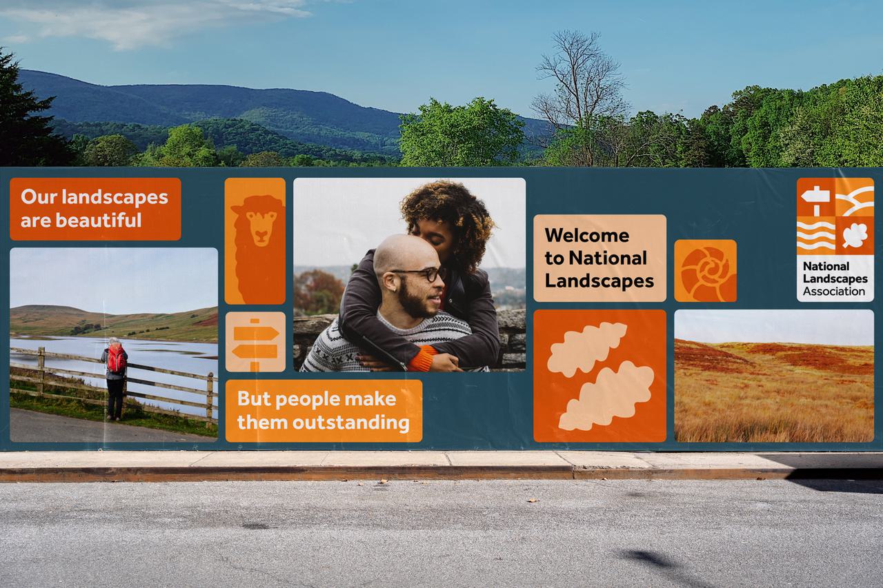
Through our research and exploration, the key theme we uncovered was centred around the unique interplay between people and the landscapes. This symbiotic concept – that people shape landscapes, and landscapes shape people – became our guiding light. With this direction, we developed a brand story focussed around the idea of National Landscapes representing ‘the fabric of us’ – a living patchwork, where each square is as essential and unique as each of us.
By connecting their history with where they are today – and looking towards where National Landscapes are heading in the future – we were able to show that whilst the landscapes themselves are beautiful, it's people that make them outstanding.
Defining an inclusive voice
With the intention of inviting more people to engage with National Landscapes, we developed a tone of voice built on a foundation of inclusivity. This was based on principles of providing a warm welcome, finding common ground, and acknowledging those who deserve to feel seen and be heard.
On top of this foundation, the tone of voice was designed to be flexible for the broad range of audiences National Landscapes need to communicate with. On the one hand, it can be bright and united for the more serious convening work they do, and on the other, it can be inquisitive and sensorial to excite and invite the public to create their own connections.
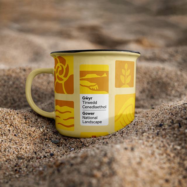
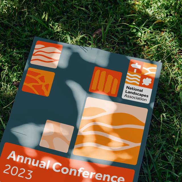
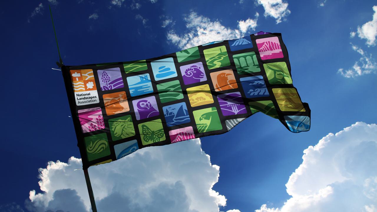
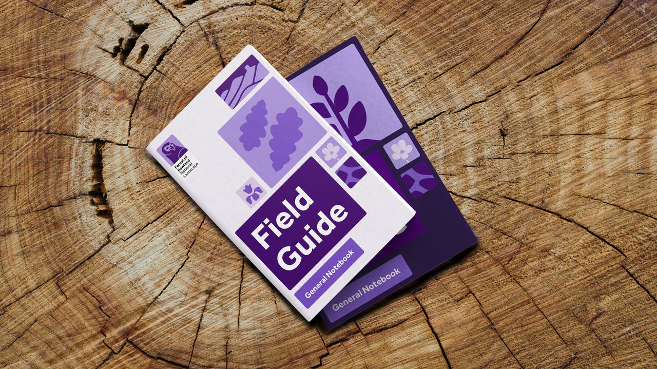
Visualising a living patchwork
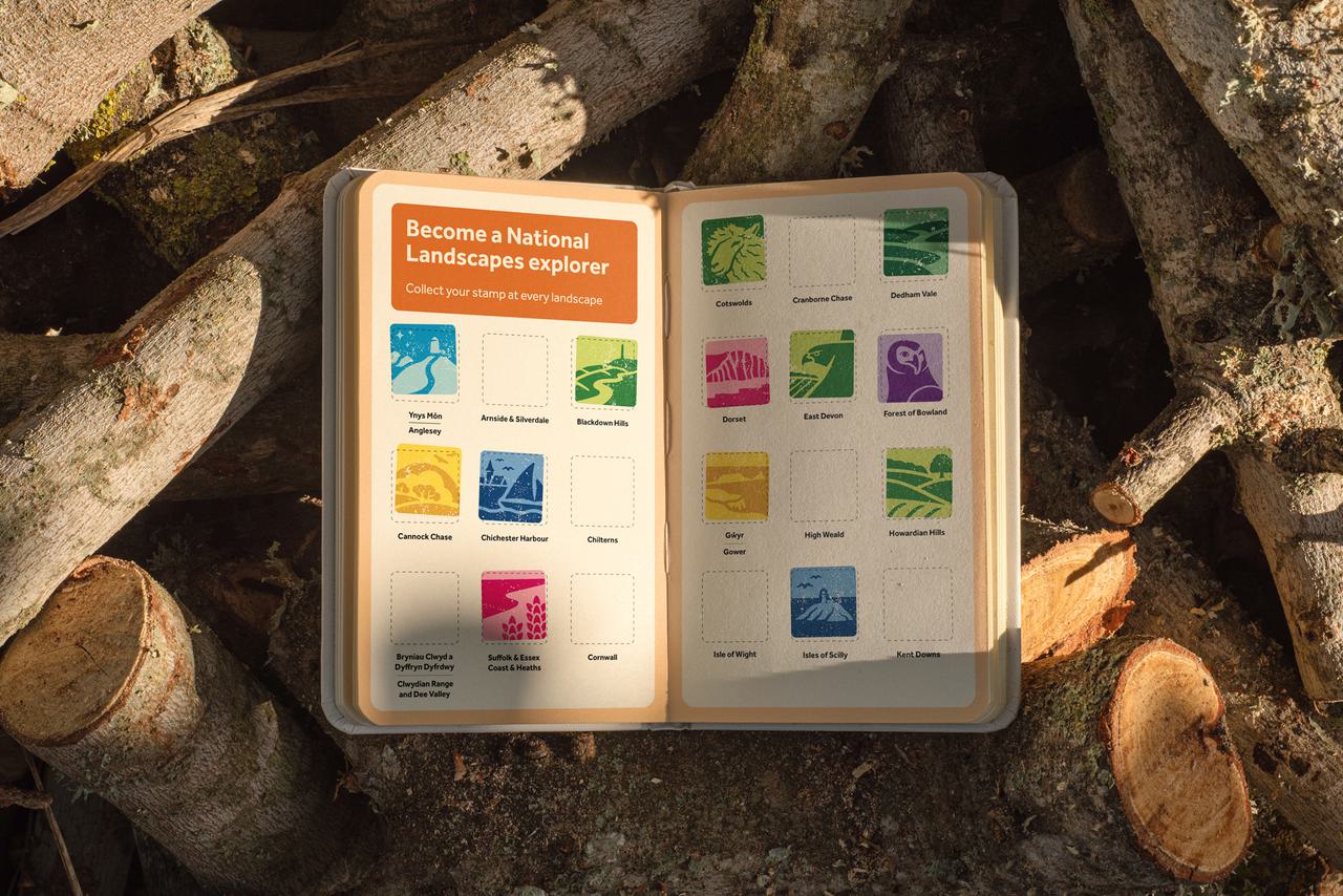
The idea of the living patchwork came to underpin our visual design system. Where each square is as unique as the next – filled with endless patterns of people and place. Up close, these individual patches represent one part of the landscape’s story, but step back and they thread together to form our nation’s fabric. One that’s vibrant, and full of life.
Oops, looks like there was an error loading your video! 😳
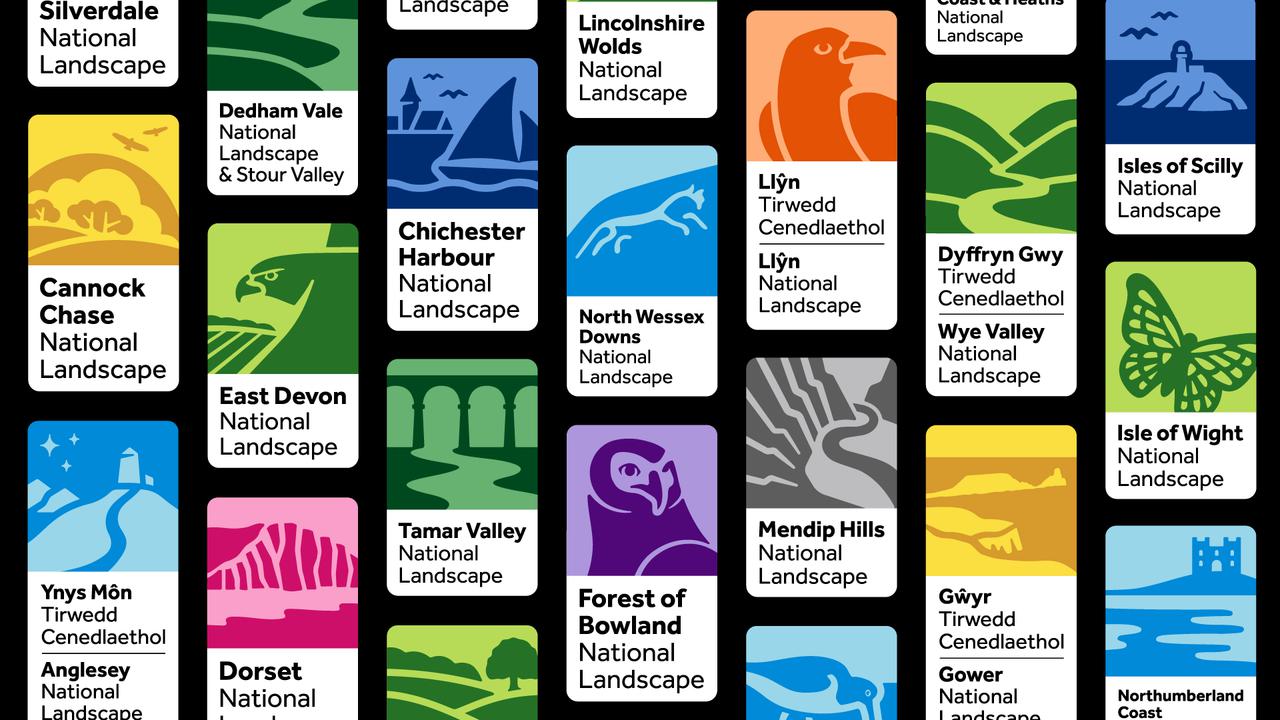
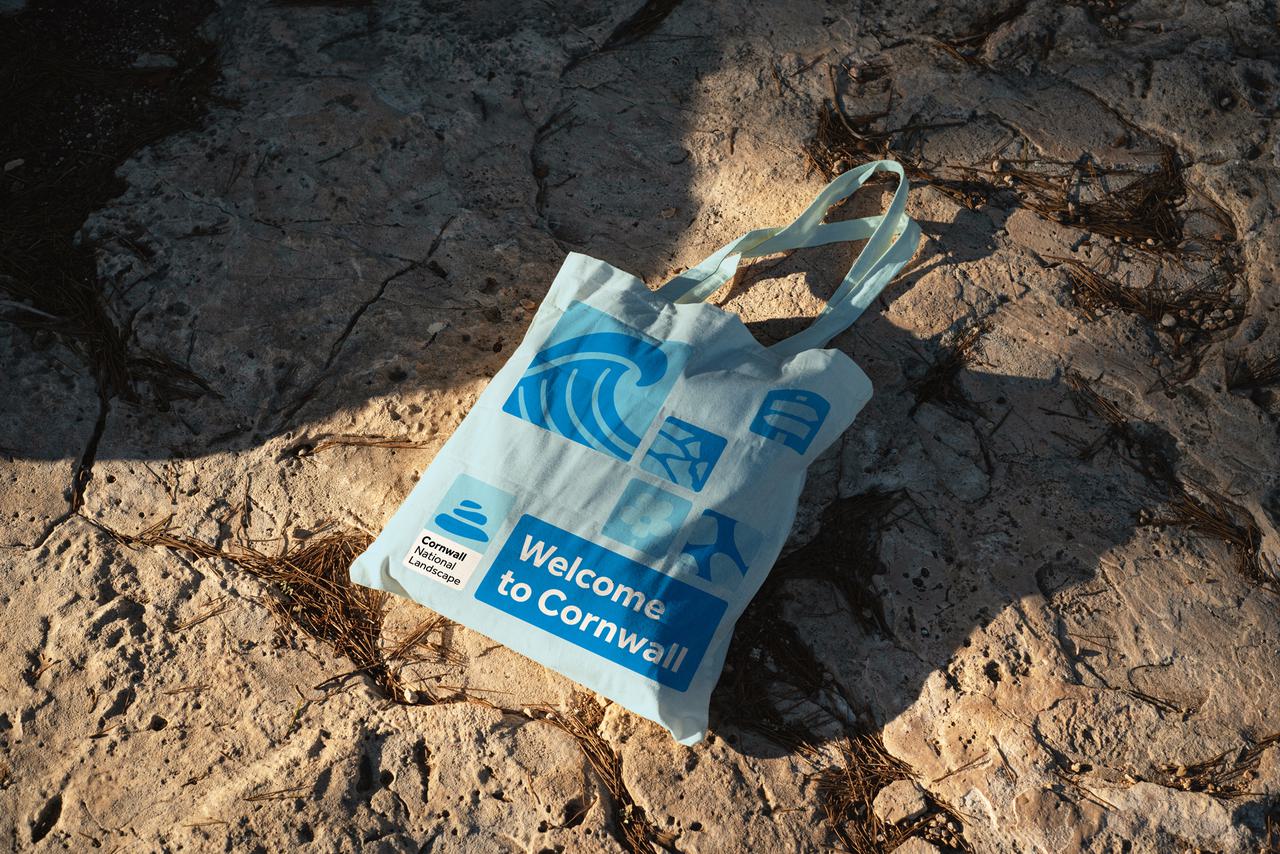
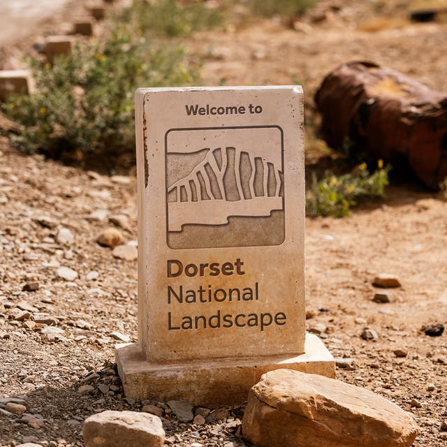
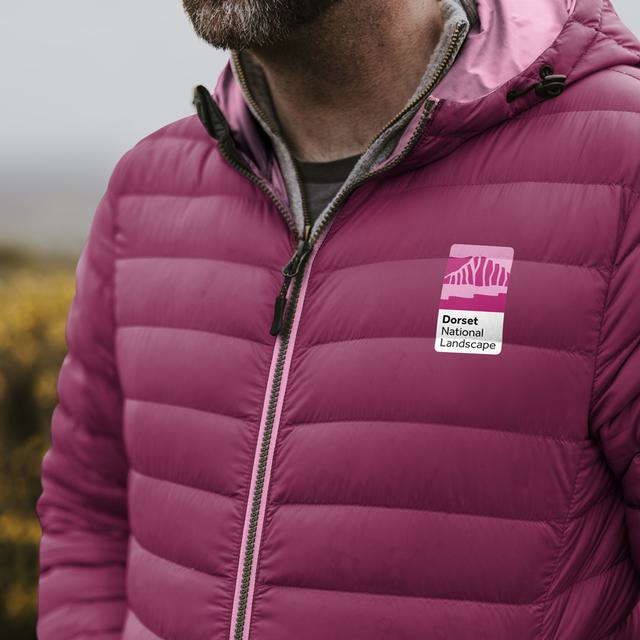
We developed an imperfect illustration style, inspired by the natural imperfections in the landscapes themselves. This style was used to create a unique emblem for each landscape – drawing on their special qualities – which when combined with other emblems created the wider graphic language.
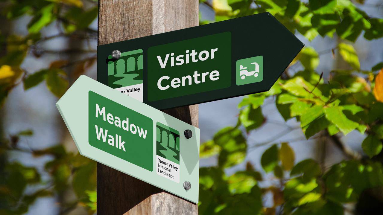
The patchwork idea naturally lent itself to a layout system based on a flexible, dynamic grid – which could be used to house patches of photography, illustration and typography – and create endless variations.
Oops, looks like there was an error loading your video! 😳
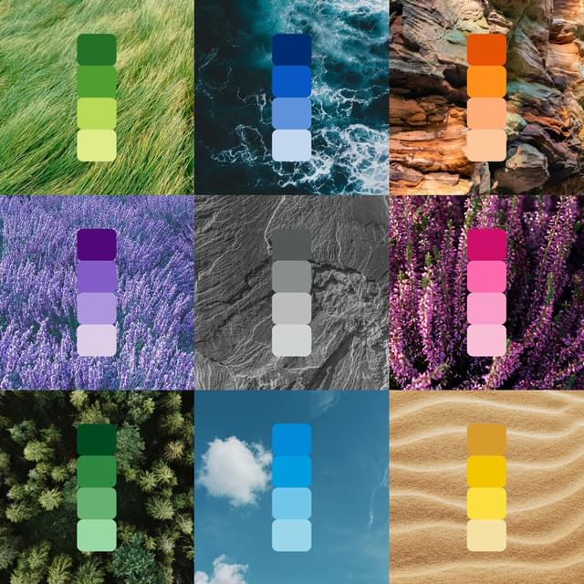
Our colour system was influenced by the defining colours of our nation’s landscapes. Ranging from sandy dunes and rolling grasslands through to deep and vibrant moors and heathlands. This allowed each National Landscape team to choose a colour that felt most true to their local personality.
We paid special attention to accessibility of the visual system. Effra was selected as the main brand typeface not only for its contemporary, humanist aesthetic but also its open characters, distinguishable letter forms and lack of ‘mirroring’ – that all help it be more legible for people with dyslexia.
Uniting 38 regions
Rebranding an environmental organisation means finding the balance between national presence and local pride. The National Landscapes Association needed a unifying identity for 38 regions — one that could celebrate individuality while building collective strength.
As part of the protected landscapes UK movement, this place branding example shows how strategic branding can drive awareness, strengthen public engagement, and highlight the vital role these landscapes play in climate and biodiversity action. By creating a flexible yet unified identity, every National Landscape can now welcome more people in, protect more habitats, and speak with one powerful voice.
Welcome to the future of protected landscapes in the UK
To launch the new brand, we developed a campaign strategy focused on bringing to life the outstanding stories from across the network that demonstrate how National Landscapes are protecting and regenerating these areas – and making sure everyone can enjoy them.
Our challenge was primarily to communicate the name change, but also to build awareness and understanding of the role that National Landscape teams play.
Oops, looks like there was an error loading your video! 😳
We built the campaign around the concept of National Landscapes being places ‘where our stories come to life’. And in doing so, we offered a warm welcome for everyone to this new era of protected landscapes in the UK. Whether that’s a ‘welcome home’ for those who live and work in these places, a ‘welcome back’ for those who have explored their beauty for many years – or a ‘welcome for the very first time’, for those who are only just discovering them.
As part of the campaign, we developed a launch film, case studies and a campaign toolkit for individual teams to activate locally.