Oops, looks like there was an error loading your video! 😳
Rebranding an industry icon
When approaching a mental health charity rebrand, the challenge is often balancing heritage with modern relevance. NABS needed to preserve their trust and legacy while ensuring their identity resonated with today’s creative industry professionals.
For over a century, NABS has been the support organisation of the advertising, media and marketing industry — providing both personal support and campaigning for wider change. But their brand no longer reflected their energy or breadth of support they now provide.
We were tasked with creating a new brand identity that put them front-of-mind for people in the industry — and attracted the new generation. NABS needed to shift their positioning, change their design and find their voice again. That was our challenge: To rebrand an icon that has a wildly positive impact on individuals and the industry.
Carving a new way forward
While it was clear that NABS' offering is more relevant and needed than ever, research showed that the brand was perceived as corporate and only for those in crisis.
But the truth is, NABS offers a huge range of support. Their advice line and career guidance is on-hand to support. Their workshops and in-house training help people and agencies develop. While their events and socials provide a space for the industry to connect as a whole.
The Unstoppable Ally
As part of our discovery process, we explored NABS’ purpose through immersive workshops. And it was soon clear that NABS is here to advance the mental wellness of our industry, so we can all keep moving forward.
NABS live and breathe the sector. Which means they’ve faced many of the same industry highs and lows as our audience. They stand with you, for you and by you. We focussed on this unique position to create the brand personality. NABS are an ally, continuously caring and championing, they are: The Unstoppable Ally.
With this as our foundation, we developed the brand principles — Be kind. Bring a Fresh Perspective. Always Ready to Roll. In Your Corner. A balance of compassion and challenge. Where it’s not about being whacky, but open. Where optimism comes with a spoonful of reality. Where doing what’s right, comes before doing what’s easy. And kindness is a given.
Oops, looks like there was an error loading your video! 😳
A hands-on aesthetic
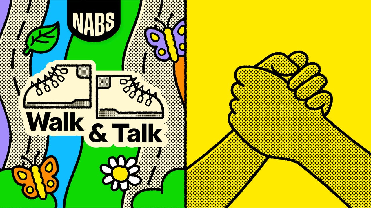
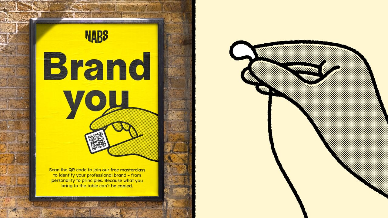
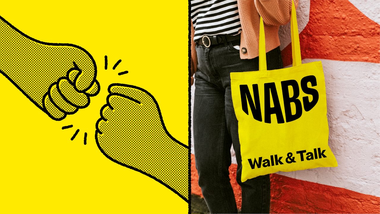
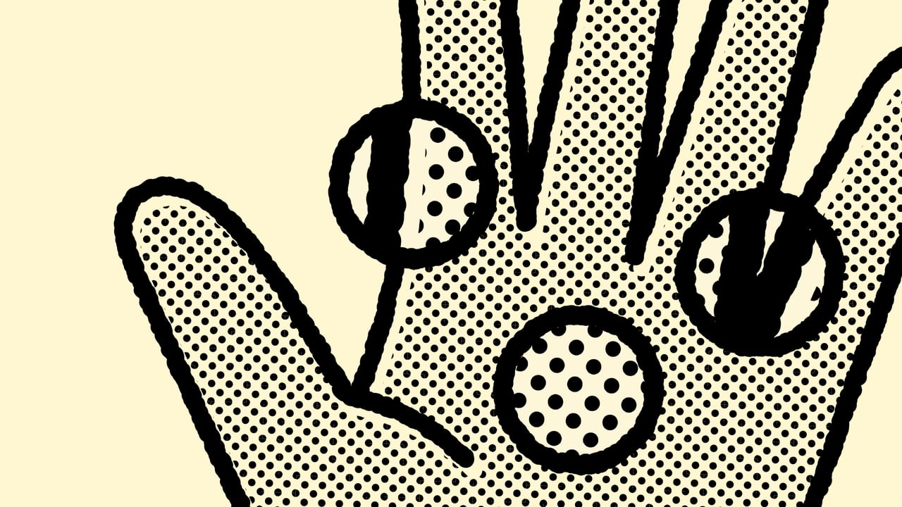
Grounded on these principles, the visual identity communicates how NABS are hands-on and on hand to help. Our hands express and explain. They’re full of emotion and even the smallest gestures convey comfort and connection.
The logo was born, like much design work, through play and experimentation. A solid, confident word mark, supported by a helping hand, which then slips out of view. Leaving us with a warm, smile curl shape, capturing the idea of NABS lifting you up and being there even when they can’t be seen.
Oops, looks like there was an error loading your video! 😳
Cut-through in both the creative and charity sectors was essential for cementing NABS’ place within mental wellness – without falling into clichés. As we worked through ideas, we couldn’t help but notice how our hands were doing as much of the storytelling as our words. Adding emphasis, softening our tone, inviting a response.
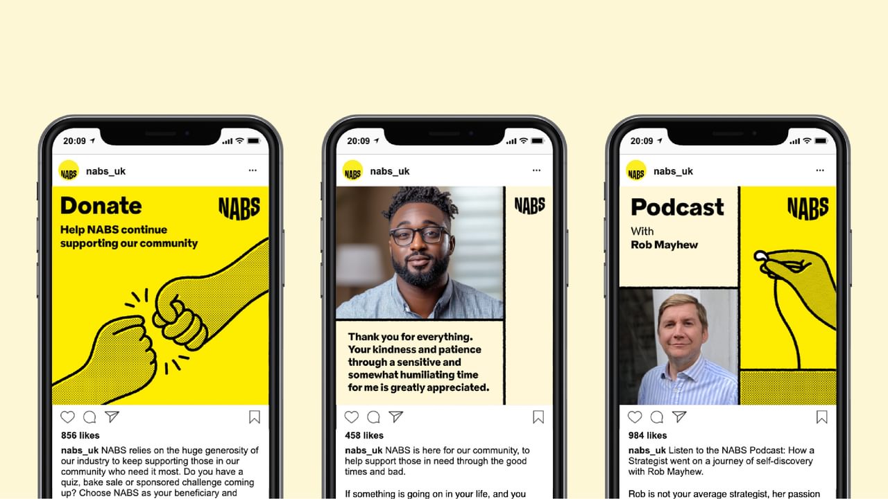
This became the foundation for the wider identity. Helping hands were used throughout to visualise NABS’ support, guidance and connection. A tight bright colour palette added vibrancy, while the illustration style referenced NABS’ legacy – the dotted halftone pattern, roughened brushstrokes and offset textures paying homage to printing practices of old. To ensure full accessibility, we chose Lexend, an ultra-legible typeface designed to increase reading proficiency across all reading ages and abilities.
Each of these elements contribute to our design framework that can flex to different audiences, subjects and tones, while feeling distinctly NABS at all times.
A new signal for the sector
The new brand stands as a mental wellness branding case study — showing how a brand refresh can reflect a charity’s core mission while engaging new audiences. By creating a mental health brand that feels authentic, human, and industry-specific, we helped NABS bring their support and advocacy to the forefront.
We wanted to show how mental health branding can move beyond awareness campaigns to create a lived, recognisable identity — one that signals approachability, action, and long-term commitment to the wellbeing of an entire sector.
So, where do we go from here?
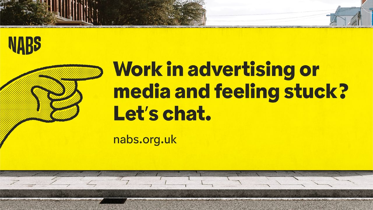
The rebrand officially launched in tandem with Mental Health Week 2025, with a website refresh and supporting communications. Now NABS is out in the world in hard-to-miss bright yellow, ready (as ever) to be on hand to help anyone and everyone — you included.
Head here to talk through something, book onto their workshops or check out their events.