Branding the first B Corp certified hotel group
Legacy Vacation Resorts isn’t just another hotel group — it’s a luxury eco-friendly hotel brand that became the first B Corp hotel collection.
Typically, the travel industry is associated with hyperconsumption. Prone to telling tourists to leave their values at home, while hotels prioritise positive reviews over positive impact. That’s where LVR are different.
Oops, looks like there was an error loading your video! 😳
Delivering sustainability with substance
We outlined how their vision needed to serve both excellent experience and environmental impact. Something the hospitality industry wasn’t really doing — a nudge to reuse your towels or take a shorter shower is a mere token. LVR wanted to make sizable change inside and out, to be wrapped up in the local landscape. We soon realised we were on the cusp of something truly new, something that deserved to be presented as a new era. One where exceptional, sustainable travel experiences can be enjoyed by everyone.
A new way to stay
At their core, LVR were committed to introducing guests to a new way to stay. A hotel where good times and good-nature combine into something delightful. Based on this heartfelt outlook, we created four values to guide the hotel group’s evolution. To swing the door wide open, while raising the industry benchmark. To be amazed and amazing, bringing a joyful lightness to every touchpoint. To lean into the local love, being inspired by who and what’s around. And lastly, to sweat the small stuff — no flashy statements, just wholesome home-from-home experiences.
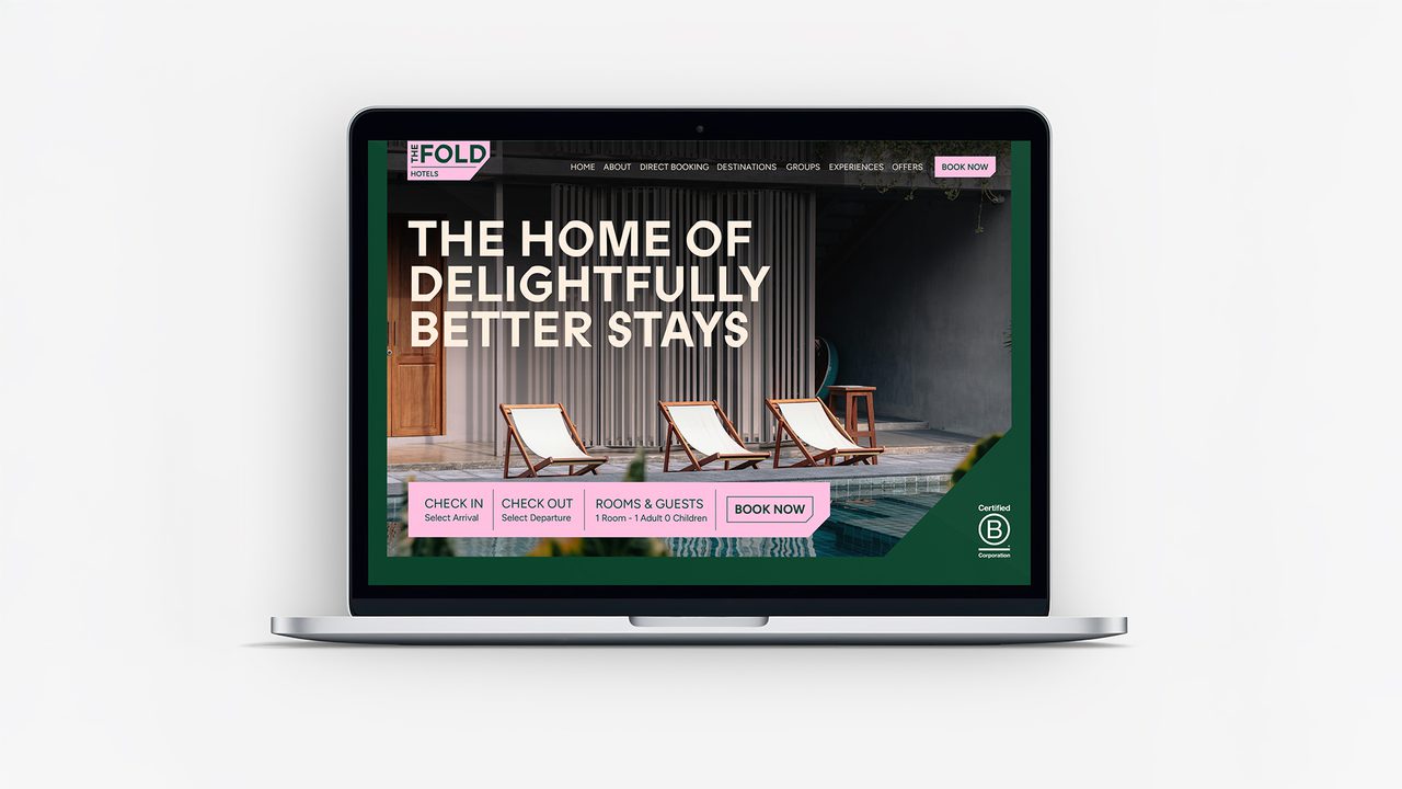
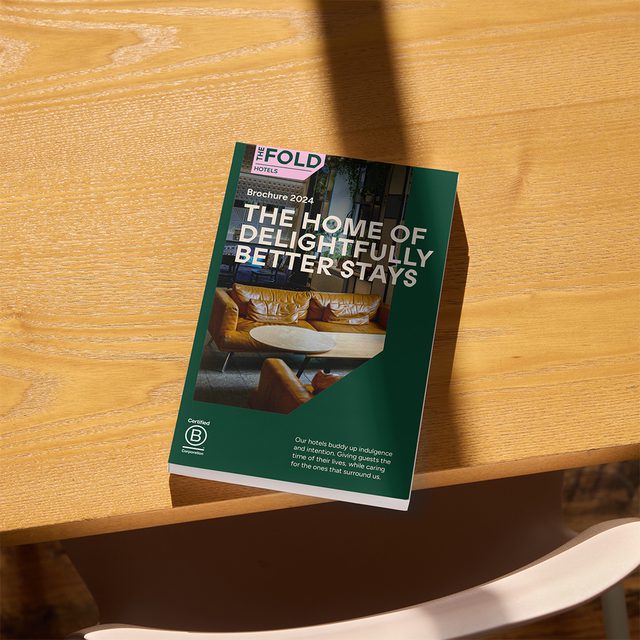
Through these values, we positioned LVR as the home of delightfully better stays. Where guests experience hospitality at its B Corp best. They are proof that hotels can be sustainable without compromising on indulgence.
Oops, looks like there was an error loading your video! 😳
Proudly, boldly different
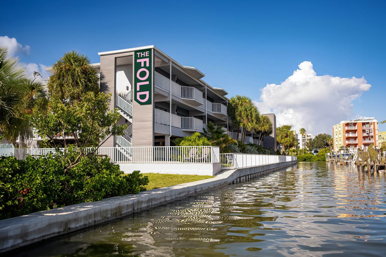
Inspired by this foundation, the name needed to communicate how these hotels are something to be proud of and part of. Somewhere you’d want to be entirely folded into. And so, welcome into The Fold. An ethos that’s proudly, boldly different. A hotel collection where style comes with heart and good value means good vibes.
Oops, looks like there was an error loading your video! 😳
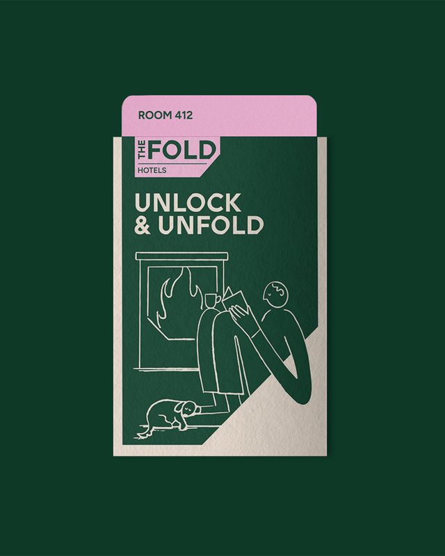
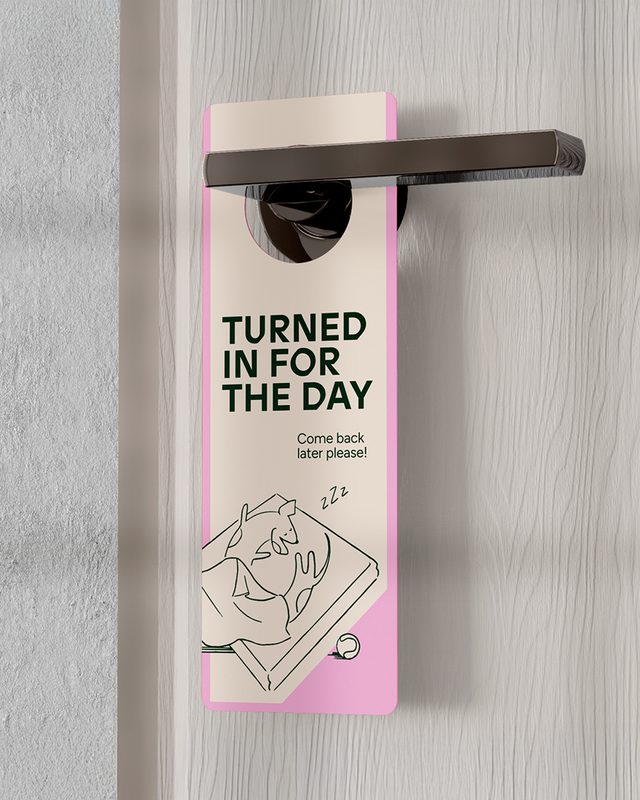
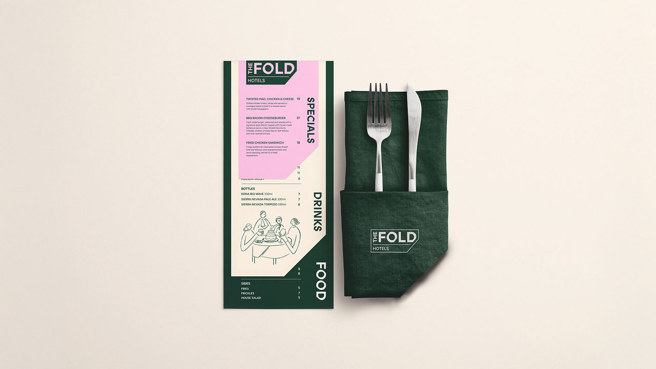
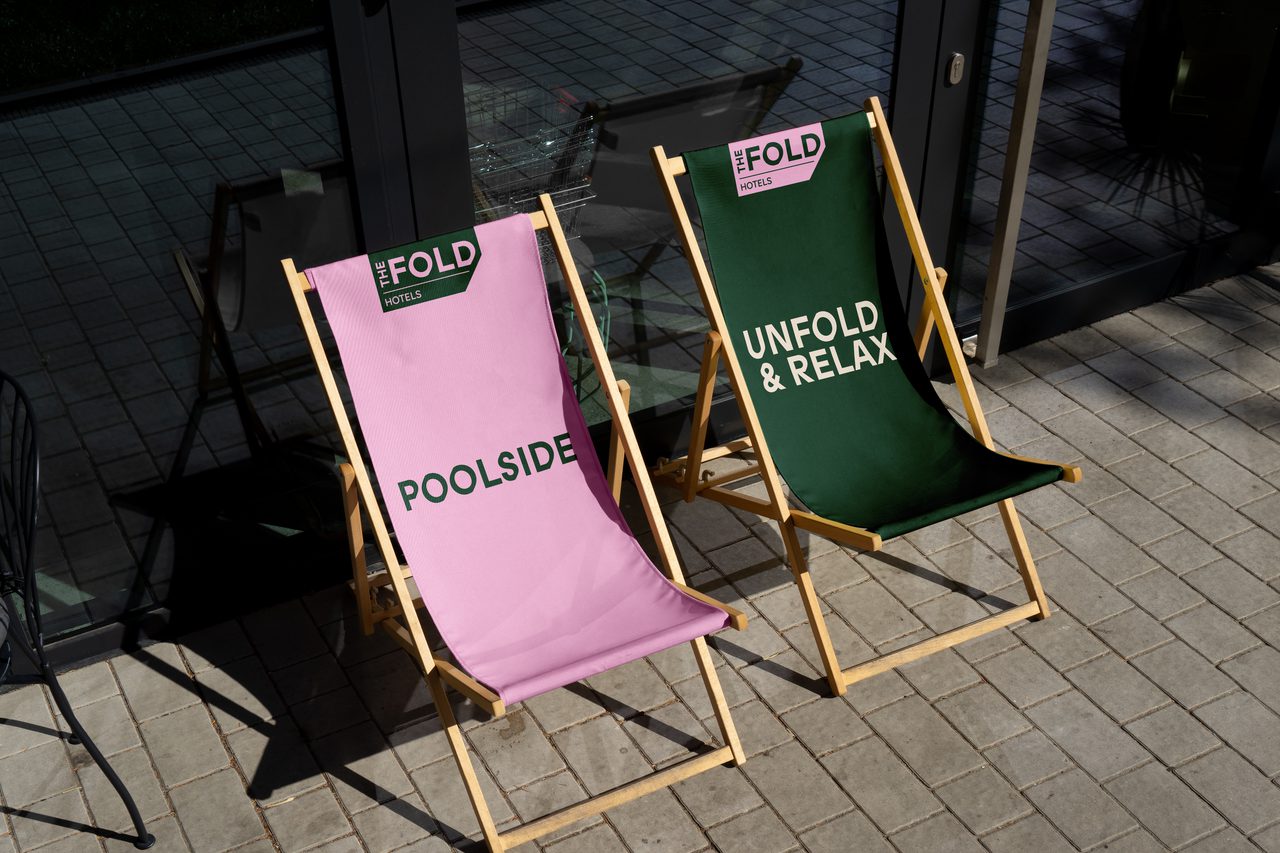
Designed to delight
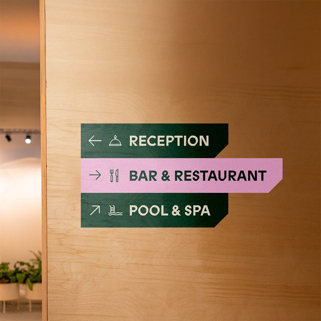
The notion of ‘folding’ came through delighting design details. Incorporated into the contemporary logo, statement typeface and in-house character illustrations — all the way through to the towels and turndown service. The logo’s sharp edges create a near embossed effect, adding a layer of luxury. A sophisticated colour palette enhances this, with Forest Green bringing depth and elegance, and Sunset Pink injecting a sense of vibrancy and playfulness.
Woven into The Fold’s pioneering energy, we created their tone of voice. Three traits that allow for head and heart to play equal roles — Wholehearted, Witty, Unshakeable. These unite to bring joy at every turn while standing for what the hotel group believes in.
A search for more
In an era where travellers are increasingly sceptical of token sustainability gestures, a hotel’s brand must deliver on more than promises. Guests are searching for meaningful experiences where their stay actively benefits local communities and reduces environmental harm. The Fold’s brand was designed to meet this demand — ensuring that every touchpoint reflects purpose as well as pleasure.