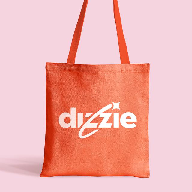

Good Club was formed in 2019 to change the way we shop for groceries. Having evolved their offering, their brand no longer reflected their ambitions. We worked with them to create a new brand identity and exciting new name – Dizzie. Better reflecting their mission to make reusable packaging the norm.
Whilst concern around plastic pollution is rising, and people are actively trying to reduce the amount they throw away (read more here), the current grocery options make single-use plastic hard to avoid.
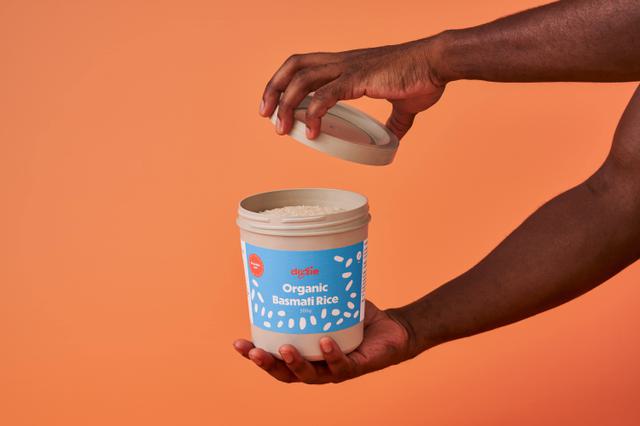
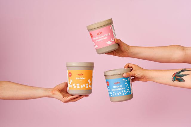
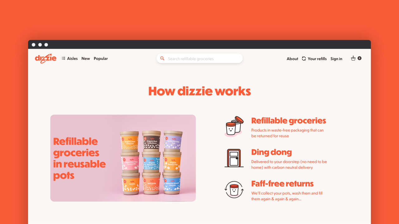
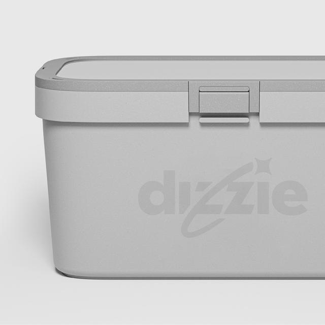
Dizzie’s new offering aims to change this – by delivering refillable products in reusable pots, direct to your door. However, to create mainstream appeal they needed to move beyond their “deep green” identity and improve desirability.
So our challenge was to reframe people’s perceptions of the reusable packaging experience. Shifting it from faffy and inconvenient to easy and aspirational.
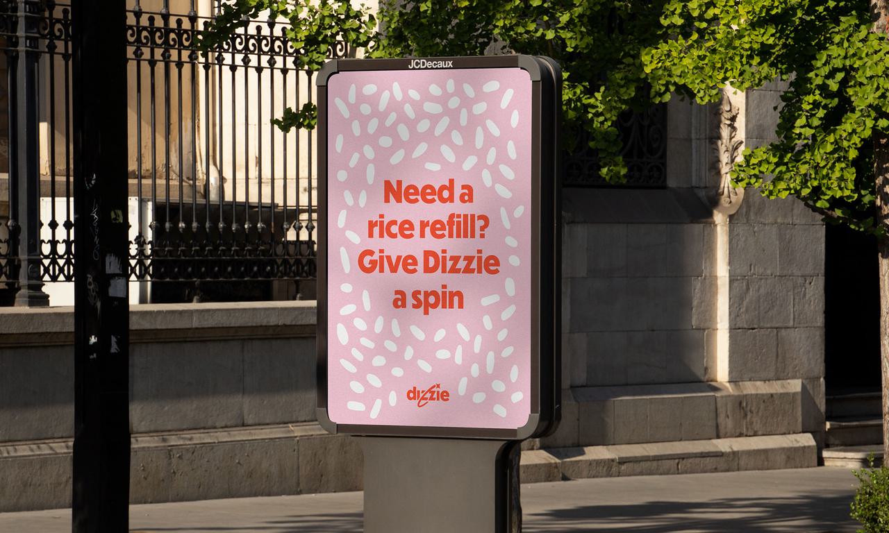
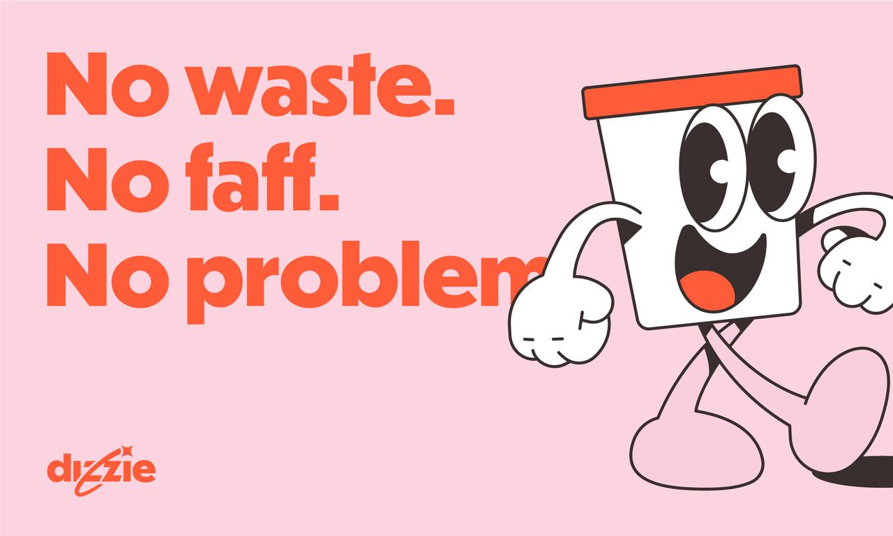
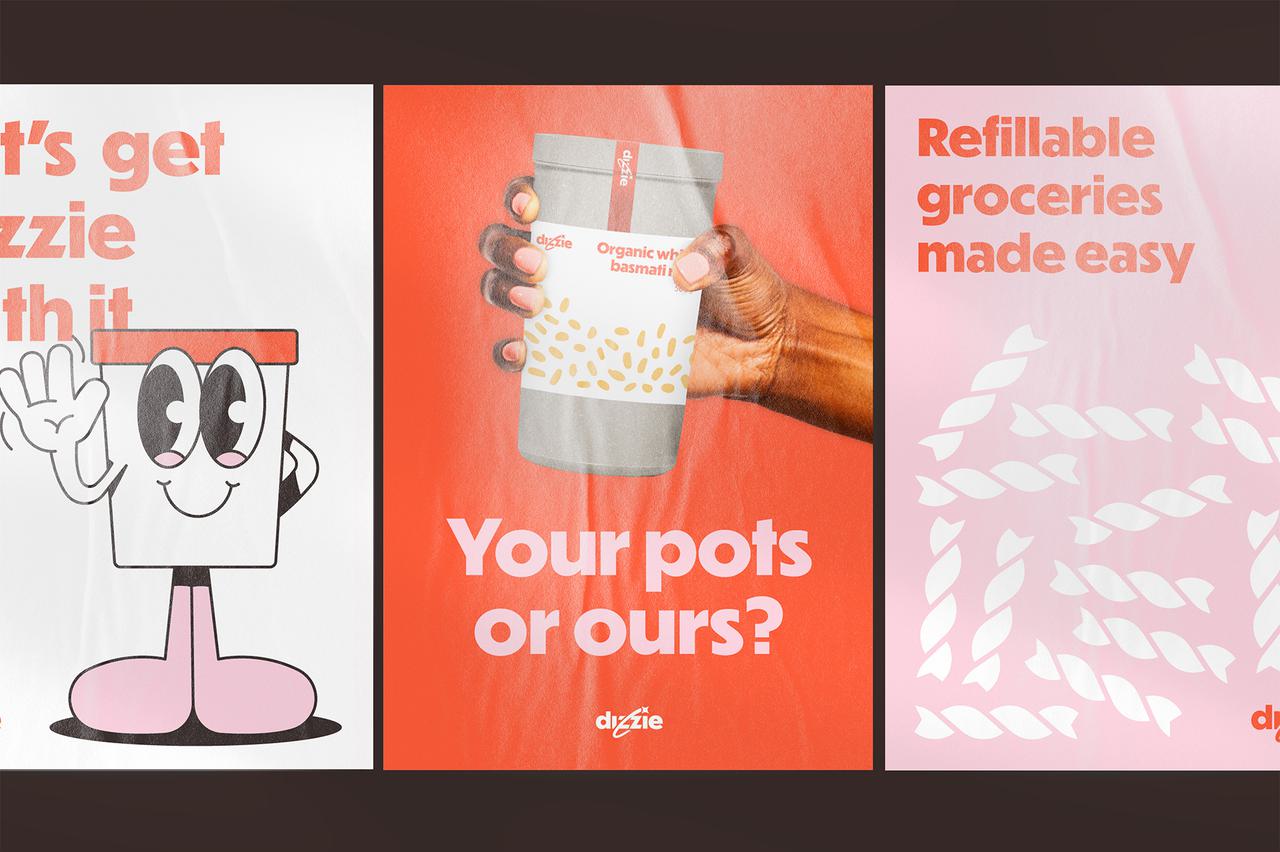
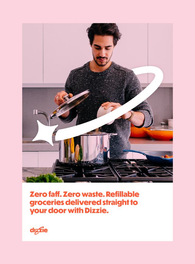
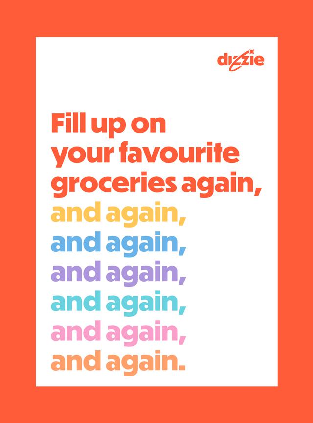
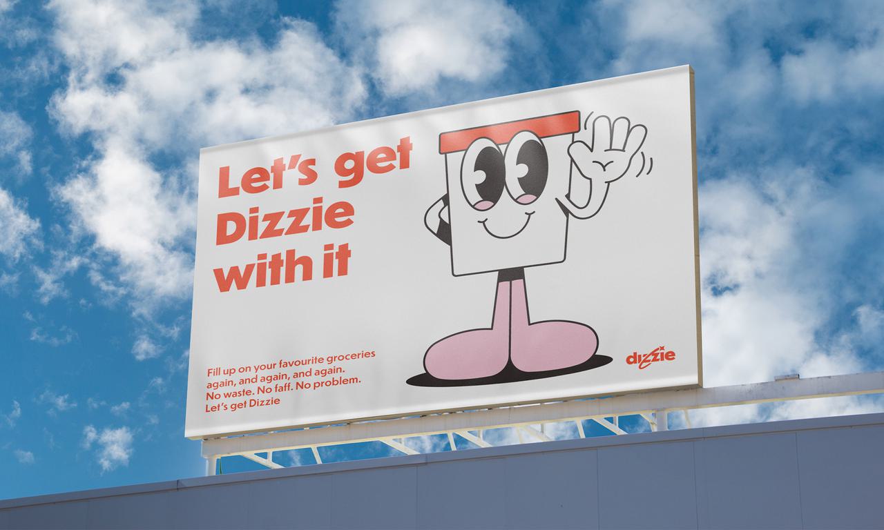
Built around the idea of ‘Groceries packed better’, the new brand identity puts a joyful spin on refillable groceries. Repositioning the reuse experience by using language and visuals that are dynamic, positive and familiar.
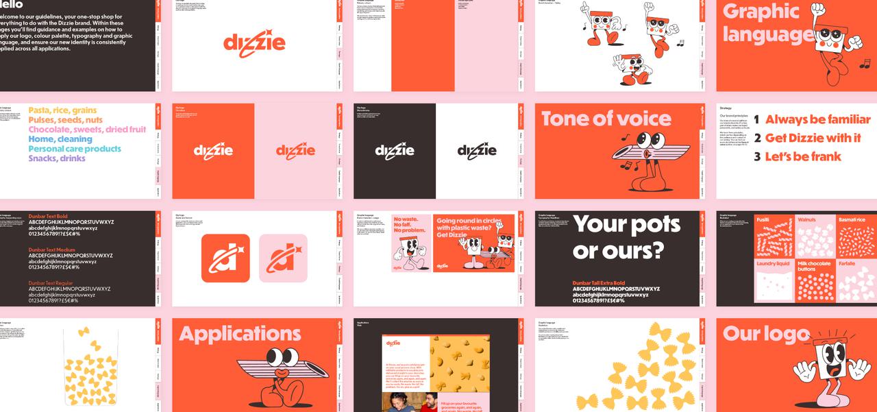
The identity was designed to work as a piece of sustainable branding that could grow with Dizzie’s ambitions in the sustainable e-commerce market. Every visual and verbal choice reinforced their eco friendly packaging mission, while building mainstream recognition and loyalty.
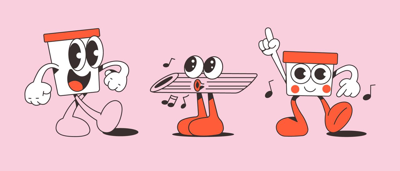
From the simplified product illustrations through to the Dizzie ‘whoosh’ and brand mascot, we created an identity full of movement and character that would help build brand recognition. Whilst combining this with a unique tone of voice that captures the surprising and satisfying moments of refill shopping, we were really able to bring Dizzie’s personality to life.
Repositioning refill
For any sustainable e-commerce brand, the challenge is making eco-friendly choices feel easy, exciting, and desirable for mainstream shoppers. Good Club’s old identity appealed to a deep-green niche, but risked excluding the many people who care about sustainability but prioritise convenience.
With Dizzie, we built a sustainable branding approach that became an eco friendly packaging case study in its own right — proving how a refillable grocery service can feel fun, accessible, and aspirational. Through movement, personality, and a bold tone of voice, we reframed reusable packaging from “worthy but inconvenient” to joyful and everyday.
Illustrations by Anthony Orozco.

