Oops, looks like there was an error loading your video! 😳
Building with the community
From the start, we knew that we needed to ensure that we created a brand which feels both true to the Switchboard experience and relevant for the wider community.
So, we built a process to seek as many perspectives as possible. This included people from across the Switchboard team, their volunteers, and members of our team – all of whom identify as LGBTQIA+.
Together, they helped influence our approach and were consulted throughout the project to strengthen our work.
Photography by Emil Lombardo
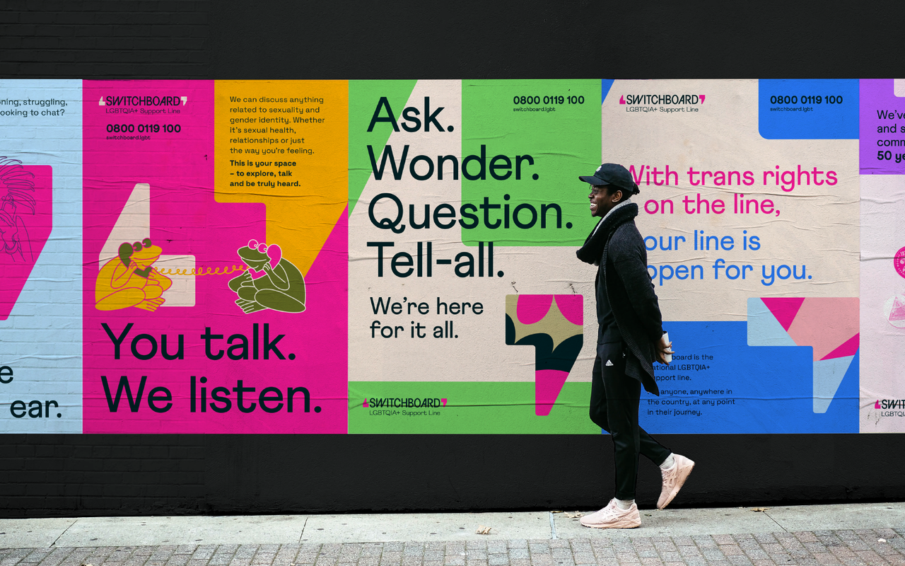
Creating space for every conversation
Our research uncovered an outdated perception that as a ‘helpline’, Switchboard was only for people in crisis. And that by using the shortened label LBGT+, they were limiting who they were seen for.
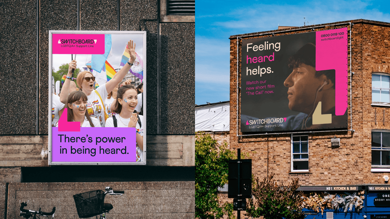
Built around the idea of creating 'space for every conversation', we positioned Switchboard as a welcoming space for anyone in the extended LGBTQIA+ community to talk about whatever is on their mind. Influenced by this, we updated their strapline to ‘LGBTQIA+ support line’ to help more clearly communicate their offer. All with the aim of helping them to achieve their vision of a society where no one in the LGBTQIA+ community feels alone.
Oops, looks like there was an error loading your video! 😳
Photography by Emil Lombardo
Flexible, but always inclusive
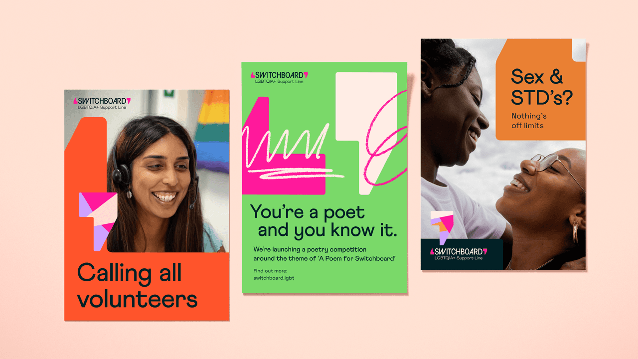
Switchboard often speak to people in very different emotional states. So we needed to make sure they could flex how they express themselves for every situation. Whether they're speaking to someone in crisis, providing reassurement or celebrating a positive moment with the community.
Our approach placed inclusive branding principles at the heart of every decision, ensuring Switchboard’s inclusive brand identity could adapt to the different emotional needs of its audiences. By combining sensitivity, dependability, and illumination, we created a brand that can hold space for crisis conversations and celebratory moments alike — all while staying rooted in community-led branding.
Switchboard is for all, so inclusive language was the foundation we built the tone of voice upon. Along with this, we developed three core principles to allow their voice to adapt, whilst still remaining consistent.
‘Sensitivity’ comes first. This means being warm, open-ended and sometimes saying less – creating space for others to talk. Next, it's about being ‘dependable’. Bringing a sense of calm and reassurance. Getting to the point, so that people get what they need quickly. And finally, to be ‘illuminating’. Putting a spotlight on hope, and stepping up with clarity and conviction when it's needed.
Oops, looks like there was an error loading your video! 😳
Oops, looks like there was an error loading your video! 😳
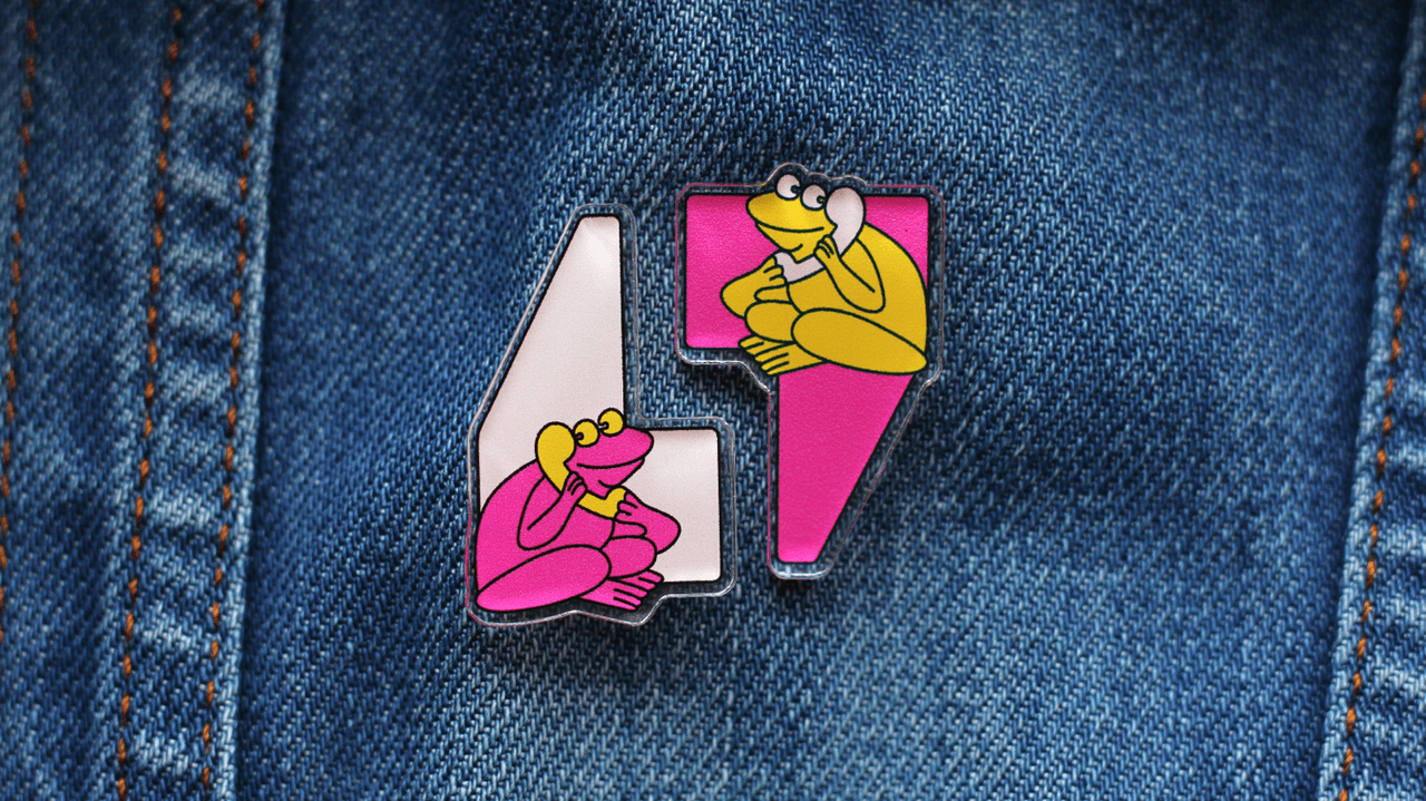
Designing the canvas for conversation
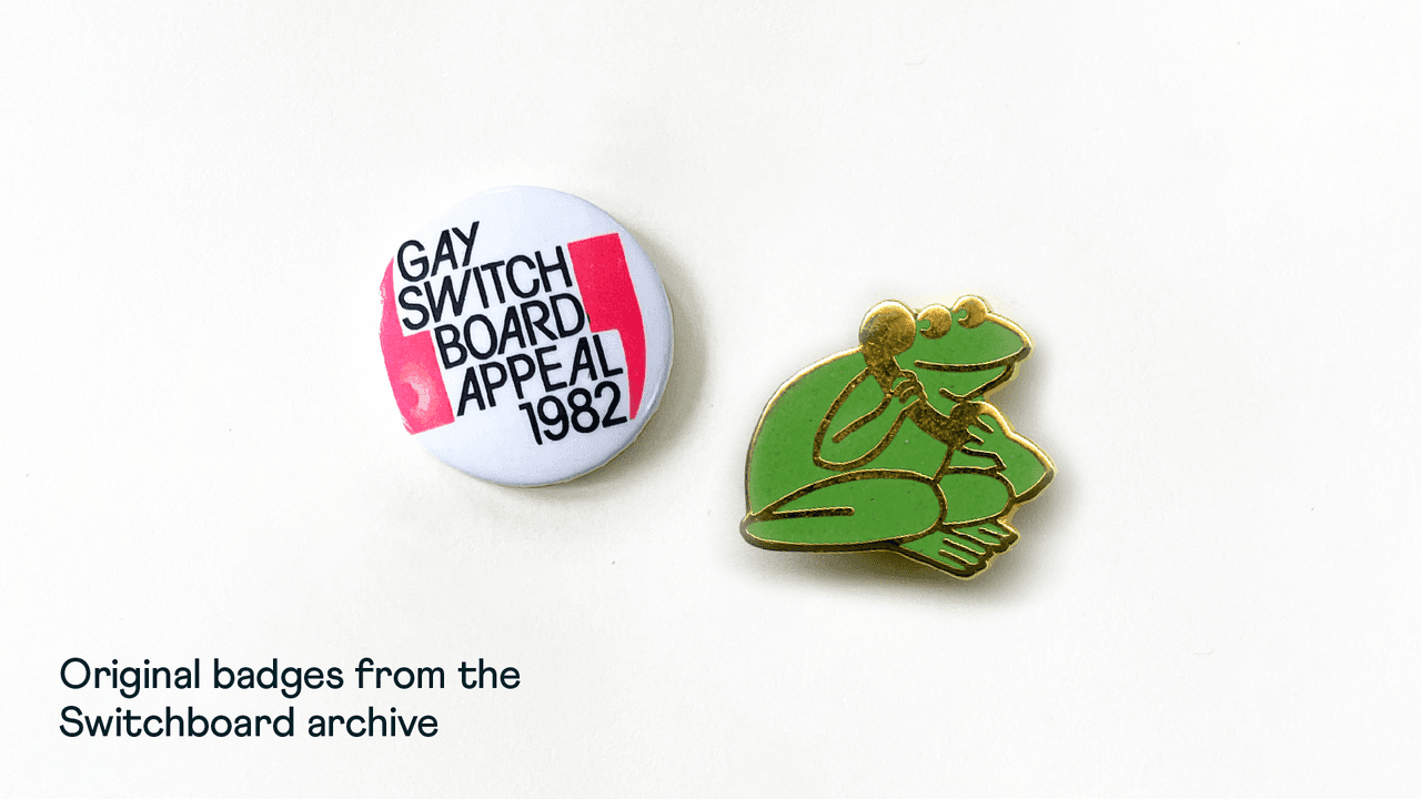
To immerse ourselves in the world of Switchboard, we began our design exploration by visiting their archive hosted at the Bishopsgate Institute. This rich history of 50 years' worth of materials provided essential inspiration for us to build from.
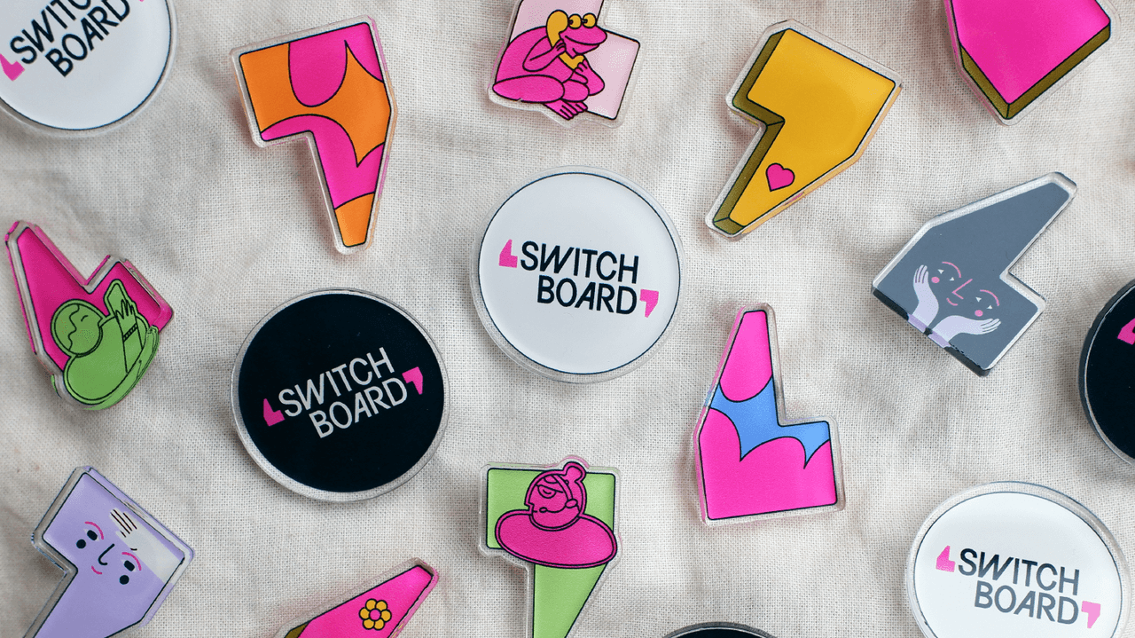
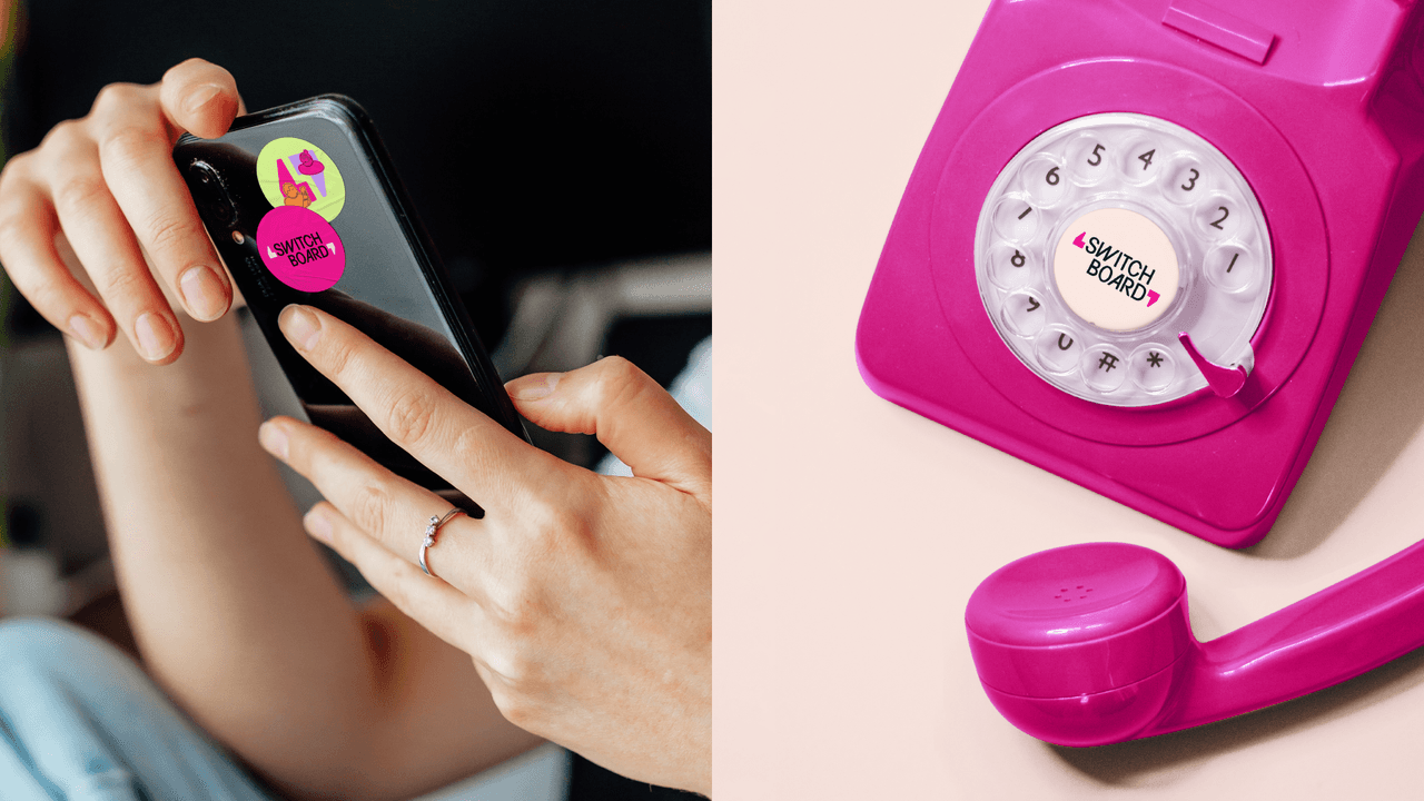
Pin badges, and the sense of pride from wearing them, were a key part of Switchboard's story. Among them, one badge in particular inspired the central motif of the new design system – the speech marks. The unique style and connection to the story about conversations presented a perfect opportunity.
The logo itself takes its form from this bit of history, with bespoke lettering housed in the space between the two marks. The speech marks then become a key part of the brand’s graphic language – a dynamic canvas for different moods and different messages. They shift and morph to create endless types of space for every type of issue.
Following the pink thread
Among the different identities that Switchboard has had over the years, pink was always present. We felt it was important to keep this as a central colour to continue to build on this historic association.
But to reflect the diversity of the changing community, we also developed a dynamic colour pairing system inspired by the rainbow flag. Like the tone of voice, this allows flexibility within the design system. It can be soft and sensitive, as well as bright, proud and illuminating.
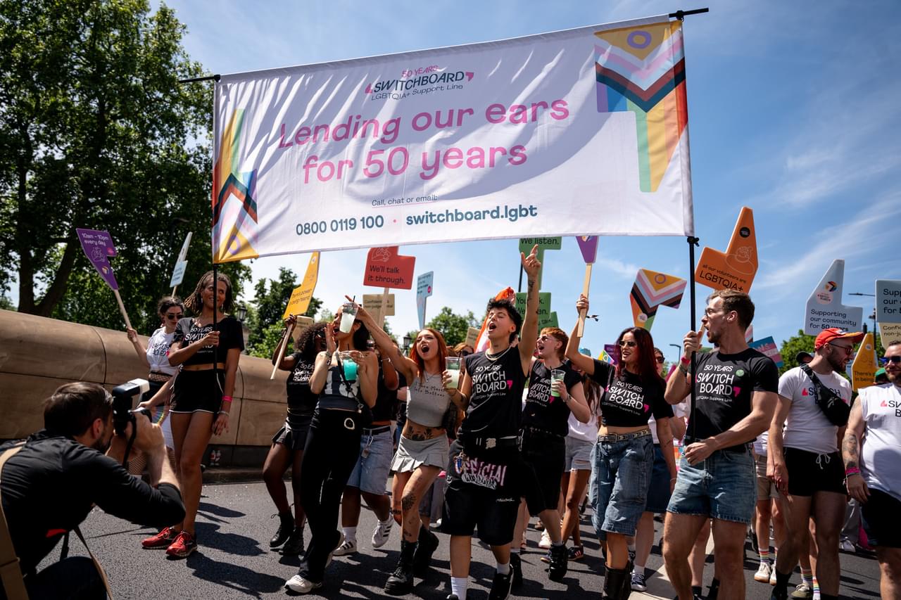
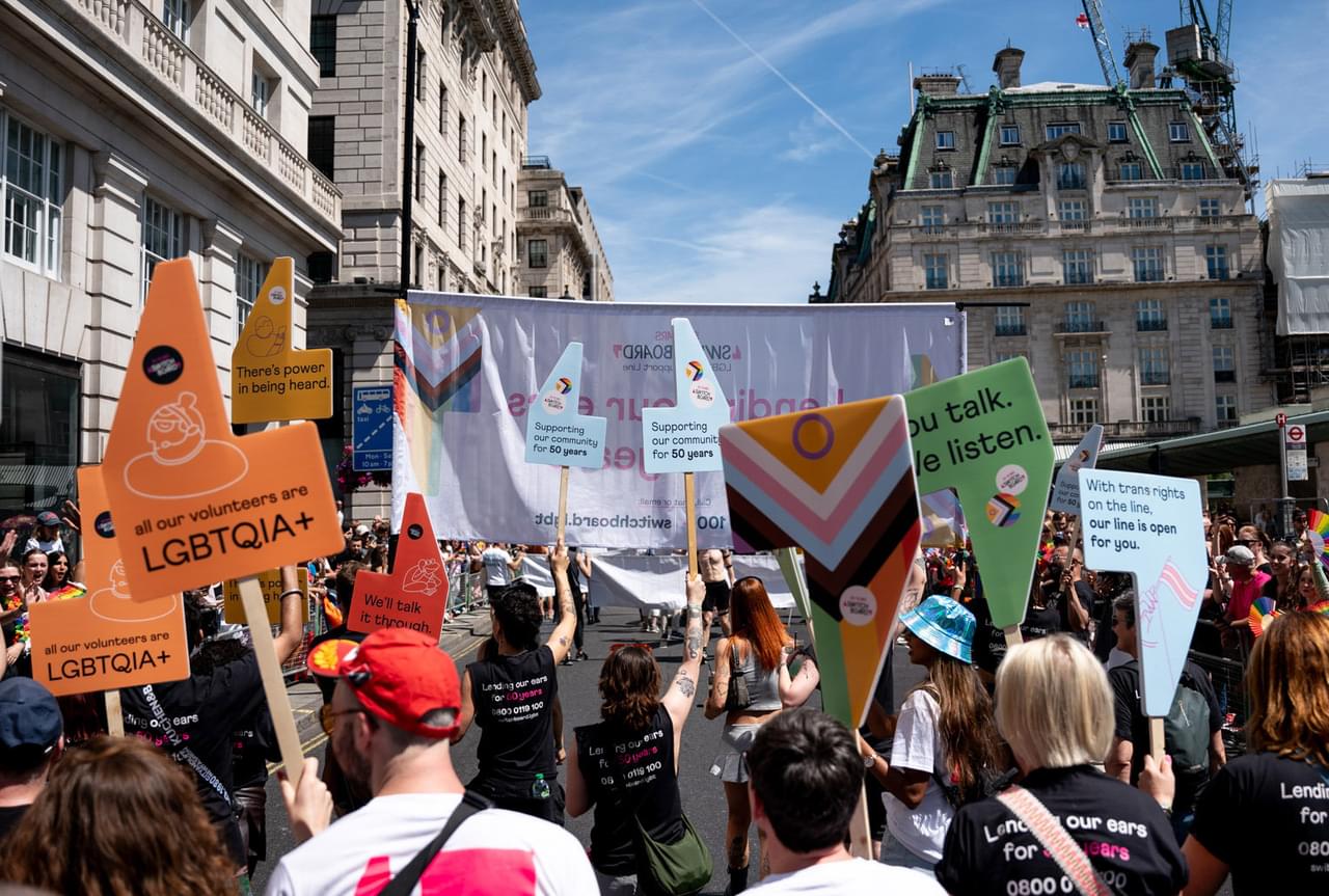
Led by the community
The personality of the community came through powerfully in the archive materials. So we were keen to keep a sense of this spirit within the new brand. In particular, the tactile feel of the old notes and memos inspired the use of a typewriter typeface to support headlines.
There were also so many sketches, cartoons and styles of illustration across the years that captured the community’s personality. So we developed an open-ended illustration style to allow the brand to continue to be a space for community expression. Steered by a few simple principles to keep it consistent, Switchboard is now sourcing illustrations from the community itself to build a library of brand assets.
Oops, looks like there was an error loading your video! 😳
Grounded in lived experience
For any organisation aiming to create a truly inclusive brand identity, the challenge is making every audience feel seen and welcome. Switchboard’s old brand was limiting who they were perceived to be for, leaving out parts of the LGBTQIA+ community they’ve supported for decades.
Switchboard’s new identity stands as an inclusive branding and community-led branding case study — showing how to build a visual and verbal identity shaped by the very people it represents. Grounded in lived experiences and flexible design, the rebrand gives Switchboard the tools to connect with more people, in more ways, without losing the trust and authenticity earned over 50 years.