


Innovations for Learning is a global nonprofit who help children in their early years learn to read. They needed a new identity that better reflected their mission to close the reading gap.
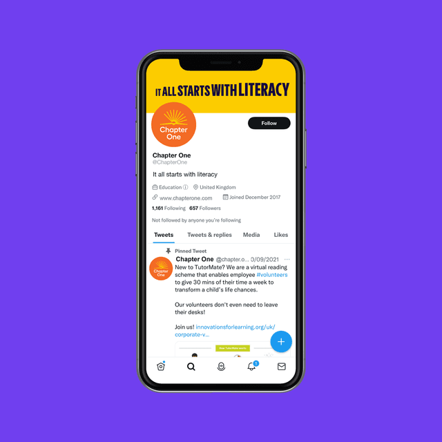
We worked with them to create a new brand identity and name — Chapter One. We aligned their master brand and services within a branded house architecture, creating clarity and consistency across their US, CA and UK markets.
Studies show that 90% of students who struggle with reading at the very start of their education will continue to do so unless they get extra help.
Innovations for Learning aims to change this, by providing children with one-to-one support at the time they need it the most. However, their existing brand was no longer reflective of their range of services in different international markets.
Our challenge was to revitalise their brand identity and create more clarity to how the brand is organised to align it with their ambitions for growth and impact.
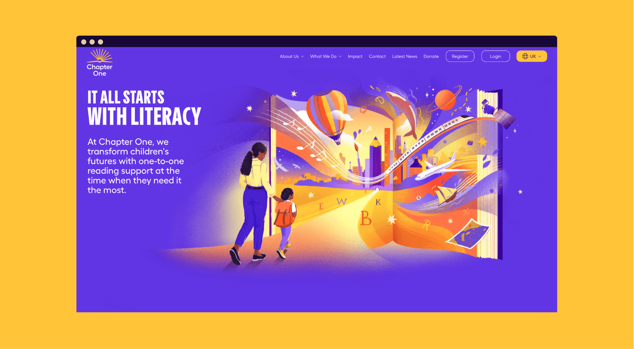
We created a new name – Chapter One – to better reflect their focus on early stage literacy.
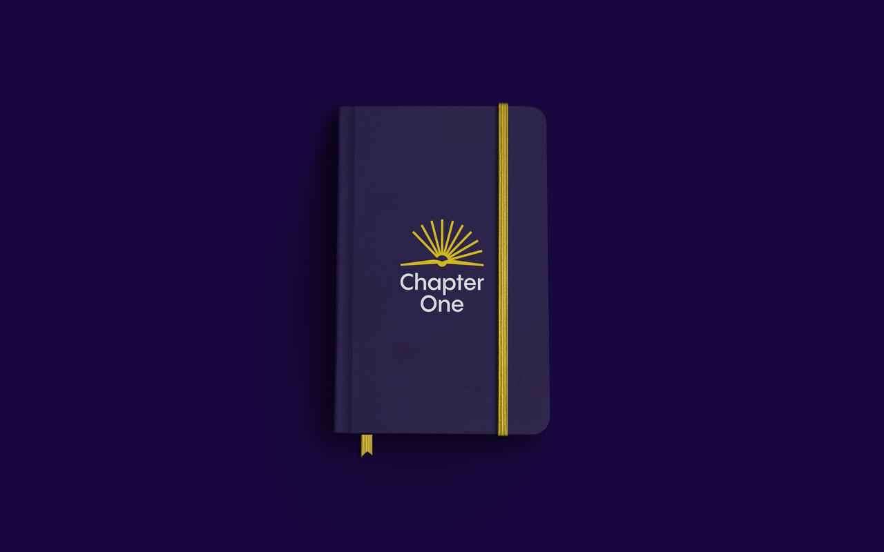
The Chapter One logo is inspired by the opening of a book for the very first time, the bright palette full of vibrancy and contrast. The yellow in the logo resembles a rising sun, reflecting their new tagline 'It all starts with literacy'.
The bold, impactful and scaling type speaks to the growing confidence children acquire as they learn to read. The illustrations are simple and geometric, their bold, colourful and warm style representing all the imaginative stories that reading can spark.
We aligned the organisation’s many services under a new branded house architecture to create clarity across markets and allow for flexibility as they grow their brand all over the world.