
The shifts in our climate are gigantic, yet the metrics we use to tell the story are tiny.
Stop press: our climate is now 1.4 degrees above pre industrial levels!
CO2 has reached 419 parts per million in our atmosphere!
For anyone who hasn’t studied climate science - 8 billion people, give or take - these numbers appear inconsequential.
Perhaps this makes our pleas for drastic action sound a little disproportionate, or even irate?
A bit like screaming SLOW DOWN WE’RE ALL GONNA DIE to someone driving 31 in a 30.
But my beef isn’t with metrics; it’s when metrics are made into headlines and expected to motivate the masses.
I think we need to find more meaningful metrics that give us a better sense of scale of the crises, or ideally, eye-opening visuals and analogies.
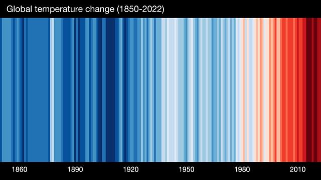
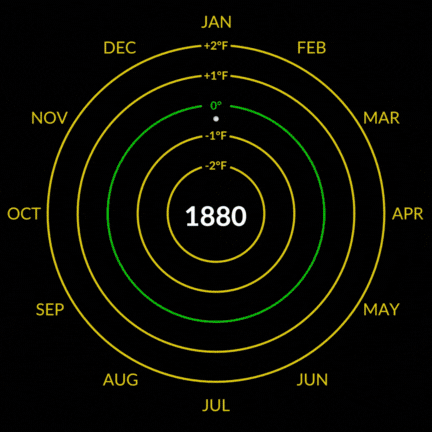
Ed Hawkins’ now iconic ‘climate stripes’ (see above) and Nasa’s ‘climate spiral’ (see below) are both great examples of this. By glancing at them, even a child would understand that what was once Lemon & Herb is now Extra Hot (to all the Nandos fans out there). But after decades of action, good examples are sadly few and far between.
Or let’s turn to the numbers. A lot of air-time is dedicated to the average increase in global temperatures, currently sitting at 1.4 degrees above pre-industrial levels (in 2023), with 1.5 degrees broadly agreed as the limit to avoid catastrophic impacts of climate change. This number is vitally important as a strategy to guide our collective commitments, but as a headline, perhaps focussing more on the average increase in the Arctic – which is heating nearly 4X faster and is now 3 degrees hotter than in 1980 – would be more galvanising. I think instinctively, most people can all imagine what happens when ice gets hotter. Who hasn’t accidentally left the freezer door open for half an hour, only to discover the frozen peas have gone a bit mushy?
Or take the concentration of CO2 in our atmosphere, measured in parts per million (PPM). Levels have increased from roughly 280 (preindustrial times) to 419 today. This is a 50% increase of the heat-trapping gas, which some people describe as acting like a blanket around our planet. I like this analogy as it’s vivid. Although naturally occurring greenhouse gases have always acted as a blanket – it’s why Earth isn’t a ball of ice. So perhaps more accurately, it’s like switching from a summer duvet to an autumn duvet on a midsummer's night; things start to get sweaty under the sheets. I suspect this isn’t strictly accurate, but it does make the analogy a little spicier.
So before you next put 1.4 degrees in a headline, or drop 419 PPM like it’s hot, have a think if there’s a more meaningful metric, a more striking visual, or an analogy that helps people see the data in a different light.