There’s 7,000+ languages in the world and I’m fluent in just two of them – Arabic and English.
There’s so much to love about Arabic. The right to left writing structure, interesting sentence formations, and different dialects have connections to other languages like French, English, Italian and Spanish. But then with English, it’s such a universal language, I find there’s this feeling of safety that comes with knowing you can use it to communicate with so many people around the world. I feel so lucky to be able to swap between the two.
But my fascination with languages really developed when I decided I wanted to make creative work that feels inclusive to as many people as possible. Now that the world is more connected than ever, the need for global connections is also greater than ever.
With words and phrases often getting lost in translation, how do you actually design a campaign that shares the same meaning across multiple languages?
Here are my seven Ts of translating campaigns that I’ve learnt to follow at Nice and Serious:
Talk translation needs up front
At the start of each project, we discuss translation needs. This helps us to prepare for and consider the opportunities and limitations we might have when designing logos and assets.
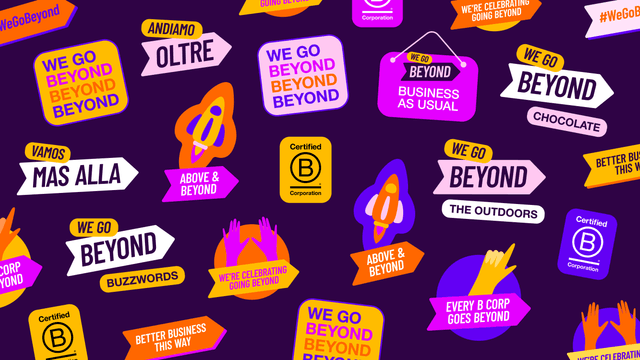
For example; We worked with B Lab global on their campaign for B Corp Month, where over 6,000 diverse companies from all industries and corners of the world come together and deploy a unified message and visual identity which celebrates what it means to be a B Corp. So we knew that we had to consider translation every step of the way. From creating logo renditions to animating text, we always made sure that we had enough time to translate the campaign assets, check them per country, and make any necessary amends.
2. Transcreation vs Translation
Sometimes if a campaign is quite nuanced, but still needs to be global, there will be instances where the creative or copy can’t be perfectly translated in every language. Here there is an argument for transcreation. This means the essence of the idea becomes translated for different countries to adopt, instead of the campaign title being directly translated for each. This allows you to keep the sentiment of the creative concept globally, just with slightly different variations.
Copy is a very important part of the package. Some idioms, common sayings, and wordplay do not translate well and can end up excluding audiences because they lose the context. To avoid this, keep language simple and easy to comprehend. You can still add a lot of creativity to how you communicate things without alienating the global audience.
4. Text needs space to breathe, in every language
To make the process of translating assets seamless, allowing breathing room for the text within the design is a must. Some languages have bigger characters, sit differently on the baseline, or even need more words. Allowing for these adjustments in the initial design makes the translated version more cohesive.
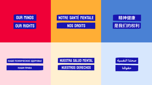
For the World Health Organisation’s annual Mental Health Day campaign, we were tasked with translating our campaign design into the six official languages of the UN. To do this, our design team made sure that every asset they were designing had enough space for the text and that each element had enough room to breathe. This made it a simpler process once we’d reached the translation phase, resulting in a much more cohesive campaign.
Fonts have come a long way since the early noughties, and so have their multilanguage counterparts. Many fonts are now designed with global comms in mind.
Noto Sans for example, is a google font which consists of 205 font families, 1,000 languages and 150 scripts/writing systems. Other popular fonts have had complementary fonts created to work as part of the same font family such as Din and Frutiger. So making sure to research and choose fonts wisely at the start of a project can help to ensure that they’re legible in the languages you’re designing in.
If the chosen font doesn’t already have a designed pairing and the writing system is unfamiliar to the designers, read the description of the fonts you’re choosing to understand which font would work best for your project.
6. Two sets of eyes are better than one
Nobody is expected to know every rule of every writing system, so it's good practice to rely on other means of quality control before publishing or submitting any final artwork. You can share your work with a team member who speaks the language, or commission a translator to quality-check the work. Mistakes in the translation and design phase are easy to make, so quality control is an additional step that should always be considered.
7. Tracking the translation process is key
From a project management perspective, keeping the translation phase organised is key to a successful final delivery. Setting up tables for line-by-line translation for each language makes it easier for both the design team and the client to ensure accuracy and decrease errors. You can always track changes and create feedback rounds to allow for the quality control phase too.
So, that wraps up our learnings so far.
While my desire to understand every language in the world might not be the most efficient use of my working hours, my team and I are always on the quest to learn new, more inclusive ways to communicate. Because when it comes to making creative work the world needs, there’s no challenge we won’t take on.