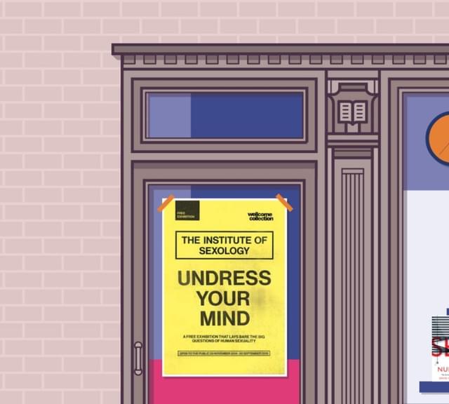
The people on the phone wanted to talk about Sex. But this wasn't Salt-n-Pepa – the legendary American hip-hop trio – this was the Wellcome Trust, one of the largest scientific institutions in the world. As part of their Sexology Season – an orgy of events and exhibitions exploring sexuality, gender, sex and ageing, porn addiction, eroticism, female pleasure, masculinity, and sexual health – the Wellcome Trust wanted a rather unusual interactive website. A website that would bring to life statistics about Briton's bestial habits, using data from the third National Survey of Sexual Attitudes and Lifestyles (Natsal).
As one of the biggest studies into sexual behaviour in the world, Natsal promised to shine a light into the bedroom behaviours of the British public. Although the harsh truth is that statistics aren't sexy. But working in our favour was the age-old adage that sex sells. So our challenge was to sex up the stats. But we didn't want to strip out the science or the sensitive issues.
The concept
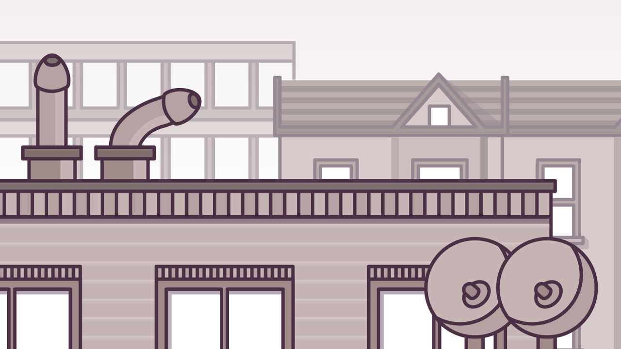
After a few brainstorms and some childish giggling - we settled on a concept that revolved around windows. By stacking a series of windows on top of each other, like a block of flats, it gave us the visual space to peek into the lives of the British public. Each level would feature an issue and each window would bring that to life through an illustration. It also gave us a nice narrative journey; starting on the roof tops, moving down through the windows and then finally onto the street level where users could then find out more about the Sexology season, or buy the associated book 'Sex by Numbers' by Prof. David Spiegelhalter.
Selecting data
The website is an interactive infographic. So selecting the right data is everything. The Natsal survey generated vast swathes of stats, so we needed to select the right bits. Luckily we we had an all star team from Wellcome, Profile Books, Natsal, David Spiegelhalter and the Nice and Serious creatives. First and foremost we looked for the most interesting data sets - the sort of stuff people would discuss with friends at the pub. These would pull users into the site and compel users to share with their friends. Secondly, the data needed to be illuminating. It needed to show change over time or an anomaly that would shed some light on an interesting social and cultural issue. Thirdly, we needed to cover a broad range of issues across behaviours, attitudes, age groups, sexualities and genders. We had to balance being entertaining, while also being informative.
Visualising the data
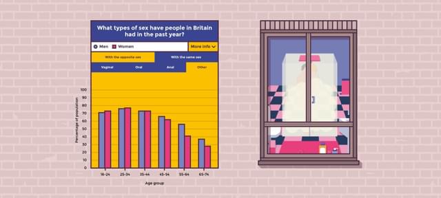
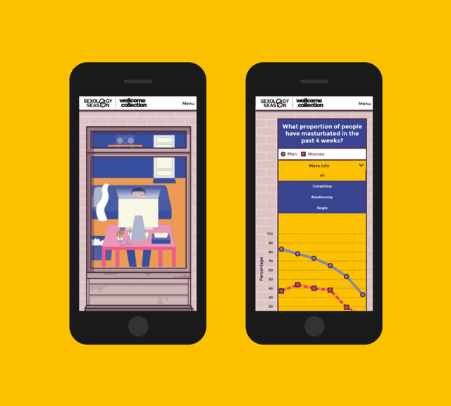
With a data visualisation project, you need to start with the data. Obvious, right? So that's what we did. We didn't want to run the risk of the data becoming subservient to the style. We wanted to convey the trend in the simplest way possible. The result was that we predominantly used line graphs. In our eyes, line graphs are the simplest way of showing changes over time - and are easy to understand with just a quick glance. We considered mixing it up with bar and pie graphs for variety, but ultimately felt this would complicate things. By standardising the visualisation of data, it creates a visual language that users pick up quickly and then apply to the rest of site. This improves the user experience. There were only a couple of instances where we had to step away from the line graph, because the complexity of the data sets needed a more customised graph.
Overall, we wanted to keep the graphs simple. Really simple. But we faced a problem. The data sets varied; some used data from different ages ranges, some included hetrosexual data only, others a mix of heterosexual and homosexual. This was unfortunate, but the reality of a large scale survey taken over three decades. If we tried to explain the demographic data behind each graph the site would become cluttered, but if we didn't we would be potentially misleading users. To overcome this we created an expandable information box to allow users to dive deeper into the demographics behind the data.
Sensitive issues
Sexual behaviour isn't all fun and frolocks. While many of the issues are light hearted, some of them are very sensitive, such as sexual diseases, paying for sex and non-consensual sex. We didn't want to shy away from these, as they're incredibly important. So for these issues, we had to think creatively about the illustration, so we didn't belittle the issue. In the case of 'non-consensual sex' we paired back the illustration to a simple drawn curtain.
The style and tone
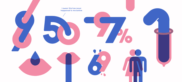
We wanted to create a website that would stand out. A website that would cut through the noise. After many rounds of development we settled on a playful, approachable style of illustration. We wanted to pack it full of character, but not to be overly childish.
This is a website about sex, so we certainly weren't going to be shy of embracing an innuendo or two. We wanted the tone of be familiar so that users would feel comfortable sharing the website with their friends and family. If we made it too serious, or seedy for that matter, it would limit its appeal.
We have to think carefully about the colour palette too. We didn't want to fall into the trap of just the site being dominated by pink and blue chiches; we wanted it to feel original. We settled on using a muted colour palette for the building and backgrounds, but then using punchy selection of colours for the graphs and illustrations to really bring these forward.
As part of the amazing Sexology Season, we hope this website will help us prudish Brits become more open about our sexual behaviours and attitudes. To find out more about the Sexology Season and to visit one of the many events, visit the Wellcome Collection's website.